The Hidden Symbols
When looking at a broad selection of vintage watches there are a few key hidden messages and symbols that seem to appear across a multitude of otherwise unrelated brands. These are little clues that help us work out the history of a given watch, some of them you’ll be very familiar with, others seem a little more esoteric…
The Hallmark of Quality
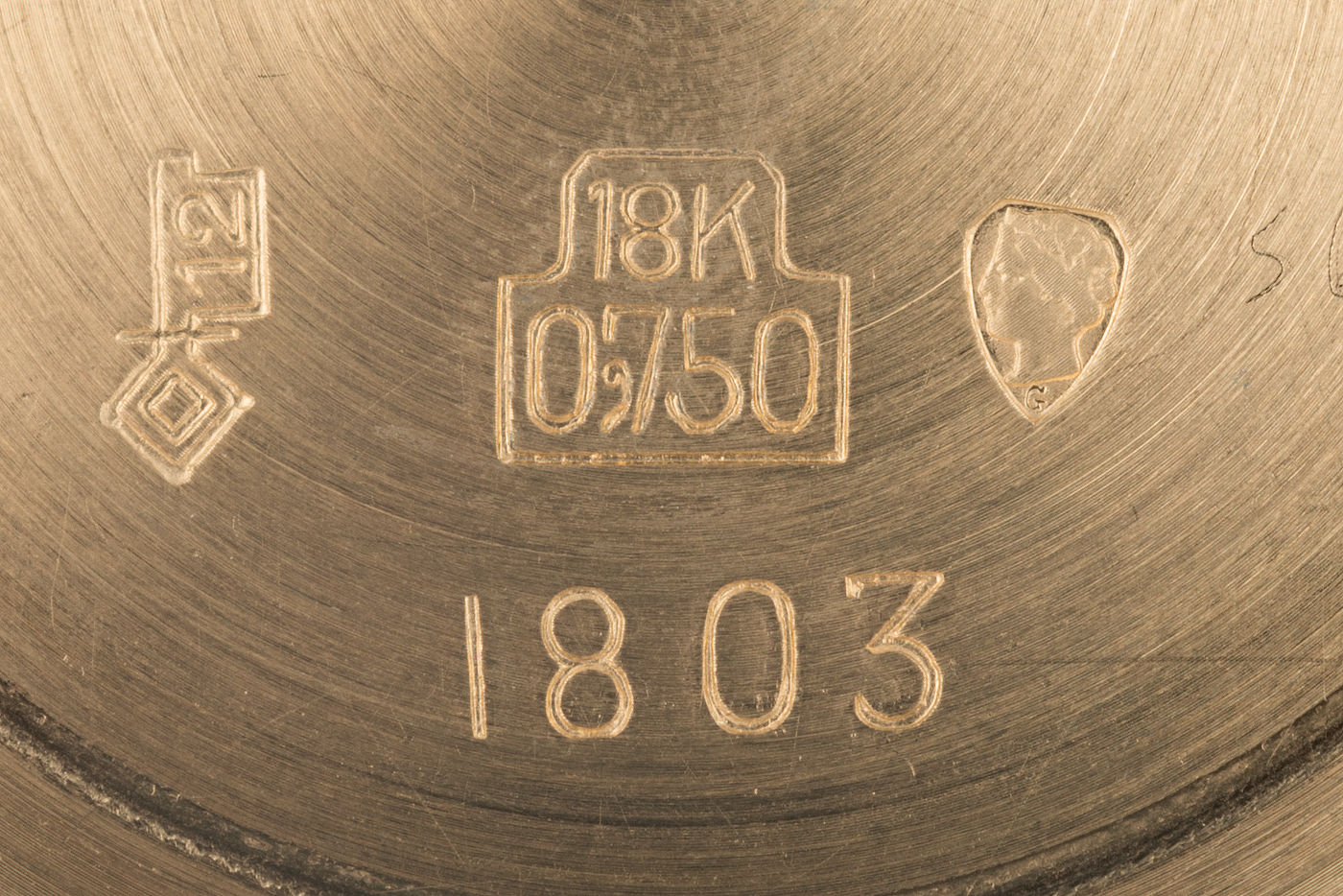
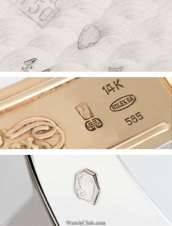
The first and most familiar are the hallmarks we see on precious metal cases and bracelets. We probably all know the different fineness marks for each metal, 750 for 18ct gold, 950 for Platinum, 375 for 9ct etc… But there are always a couple of little characters that appear alongside them. One of the most commonly spotted on vintage watches is a lady’s head in a shield, her name is Helvetia and she appears on all 18ct gold cases produced in Switzerland while a little letter below her can indicate exactly where the Hallmark was struck, G for Geneva, C for La Chaux de Fonds etc. A cheeky squirrel for 14ct gold, a grumpy little Lynx denotes an imported watch case (or bracelet) of a minimum quality of 14ct Gold and an agile mountain goat for Platinum.
Since 1995 however, all of these happy characters were replaced with a St Bernards head, still marked with the assay offices letter but he appears on all precious metal items whether imported or domestically produced.
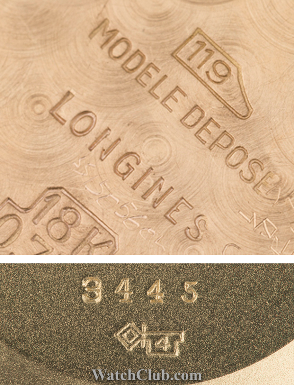
The makers mark, required by law since 1933; these marks appear on cases made from precious metals and are far more cryptic than the hallmarks we looked at earlier. These appear as hammers, keys, shields or crossbows, each with a number inside. The combination of the symbol and number is unique for each case maker, here the 119 in a hammer head tells us the case was manufactured by Gindraux SA, the key with a 4 tells us that the case of this Patek 3445 was created by Antoine Gerlach SA. Interesting marks to look for are the famous Gay Freres bracelet manufacturer, whose distinctive GF logo appears alongside a key with the number 32, or the 136 in a hammer head that denotes C.R. Spillman, case makers for the Daytona.
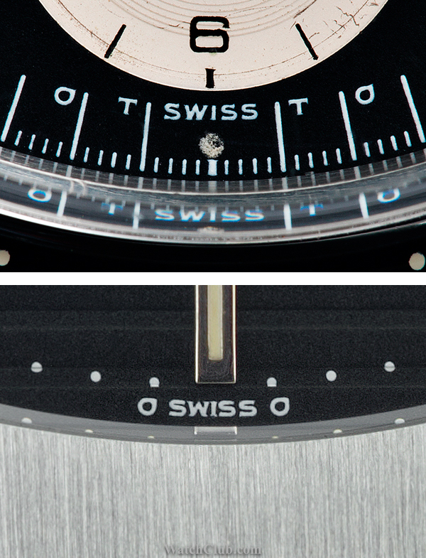
Illuminating the Dial
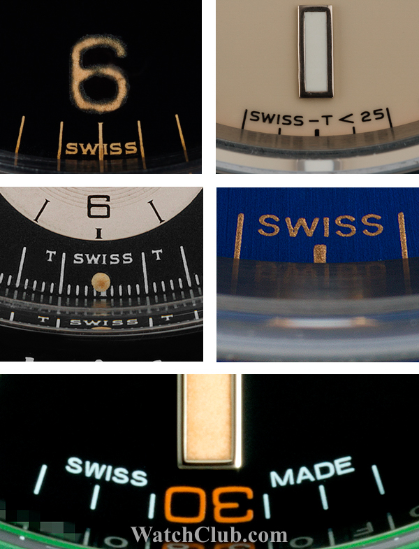
The first thing anybody looks at on a wristwatch though is inevitably the dial, and again, due to Swiss law, there is some surprisingly useful information to be gleaned from them. Namely the type, and power of the luminous material used. At the bottom of the dial there are a few little signatures that can appear, the most common to appear on Rolex dials, in chronological order are:
“Swiss” indicates use of Radium
“T Swiss T” introduced around 1963 to indicate Tritium is used emitting fewer than 7.5 milliCuries
“Swiss T<25” Introduced around 1963 to indicate Tritium is used but emiting fewer than 25 milliCuries
“Swiss” Reappears briefly around 1997 for a year or two to indicate use of non-radioactive Luminova (it should be easy to distinguish a 1950’s watch from a 1990’s dial though!)
“Swiss Made” indicates use of non-radioactive superLuminova
These little hints can be used to determine if a dial was originally factory fitted to the watch. We would immediately know that a Swiss T<25 dial cannot appear on a late 50’s watch and that a 1970’s GMT with a Luminova dial is a service replacement.
Gold Standard
Credits: Chris Youé