Rolex Daytona 'Paul Newman' – the Insider's Secrets
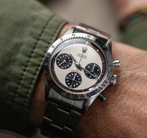
In October 2017, Paul Newman's own watch, the source of the legend, sold at Phillips Auction for $17,752,500, making it then the most valuable wristwatch in history.
In the 1980s, Paul Newman's name became attached to a tiny group of rare mid-century Rolex watches and their value began to regularly outclass all other watches. Now, even highly complex masterpieces like the 1932 Patek Philippe Henry Graves Supercomplication struggle to rival the Rolex 'Paul Newman' for market performance. Top-end wristwatches have transcended from mechanical masterpieces into pure art, with the Rolex Paul Newman Daytona at the summit of this paradigm.
So what exactly is a Rolex Paul Newman, and how does it differ from its precursor, the 'classical' Rolex Daytona?
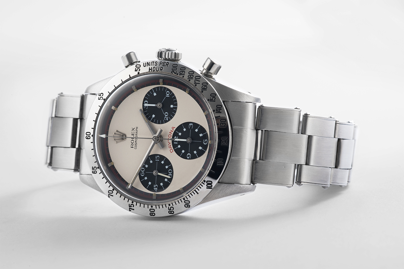
Simply put, a Paul Newman is a special variation of dial for the famed Rolex Daytona. The Daytona, marketed as a race-car driver's watch, was made available with a choice of silver or black dial. In addition, Rolex also offered a completely different style of dial, listed in their catalogues as 'Exotic'.
But watches often evolve their own, organic nicknames. After the actor Paul Newman was spotted wearing a Daytona with that very dial in a 1980s Italian magazine, the 'Exotic' Daytona has universally been known as the Paul Newman.
This dial was only available for a few years around the mid-1960s; most were only fitted to order, to an already-rare watch – these factors began to align the stars for greatness.
___________________________________
Five ways to distinguish a Rolex Paul Newman from a classical Daytona:
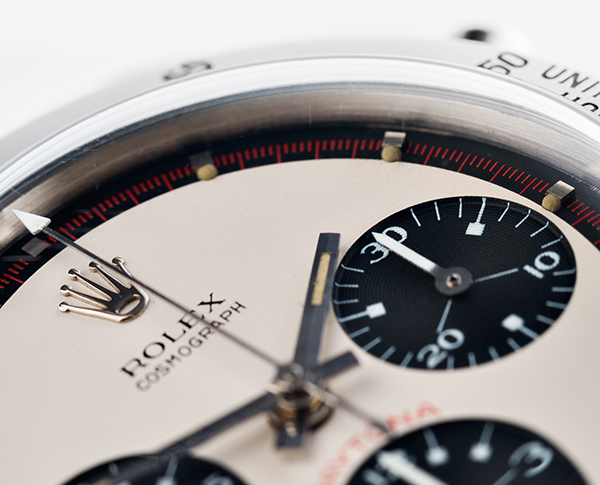
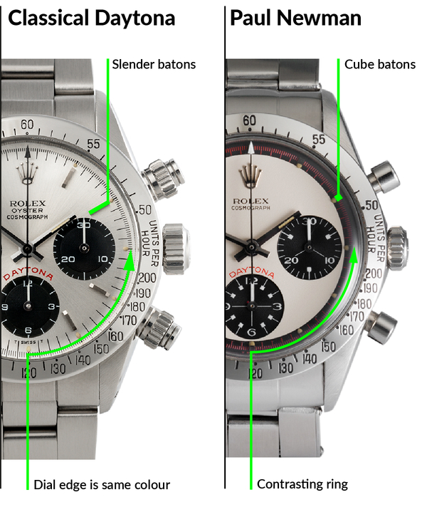
A. The most obvious difference between a classical Rolex Daytona and a Rolex Paul Newman is that the latter has a contrasting colour at its outer edge.
In a Paul Newman, whatever the predominant dial colour, the seconds chapter ring is always finished in the ‘opposite’ colour. The predominantly cream-coloured Paul Newman dial on the right has a separate black seconds ring. The classical Daytona, at left, lacks this. Its silver field extends unbroken all the way to the dial's edge.
B. The classical Daytona has slender metallic hour chapters/batons. In a Paul Newman these are like small cubes. They are topped with a dome of gloss black lacquer in those Paul Newmans with black dials, and are mirror-polished metal when the dial is cream-coloured.
_____________________________________
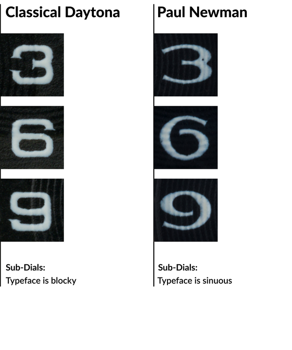
C. The classical Daytona's sub-dial numerals have a ‘blocky’ typeface. The Paul Newman's typeface is stylised, with varying-width strokes and sinuous curves. This can be seen most clearly on a Paul Newman’s threes, sixes, and nines.
_____________________________________
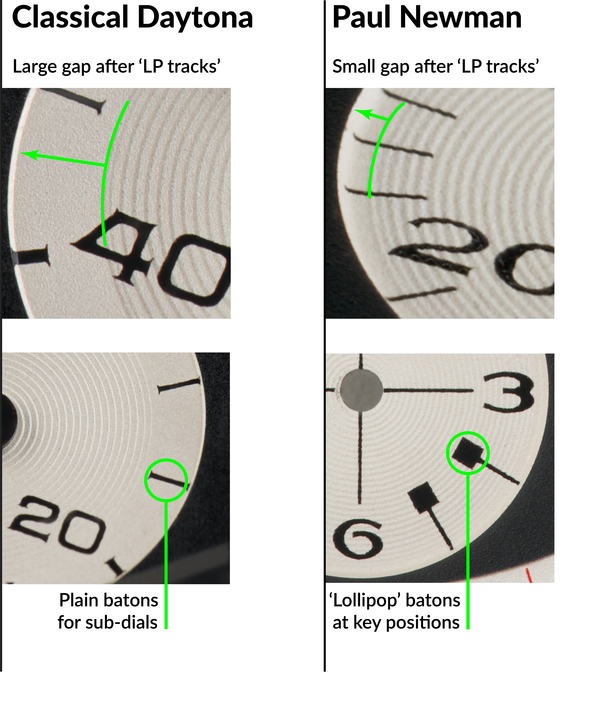
D. The sunken sub-dials of both are incised with subtle concentric circular grooves. In classical Daytonas, the grooves stop well short of the edge. In the Paul Newman, these ‘LP Tracks' extend nearly all the way to the edge. The grooves are there to aid legibility, giving a contrasting reflection of light for the small subsidiary hands.
E. On a classical Rolex Daytona, the primary markings in the sub-dials markings are plain batons with serifs. The equivalent markings on a Paul Newman have a pronounced squared-lollipop appearance. From a distance, they look like big dots.
_____________________________________
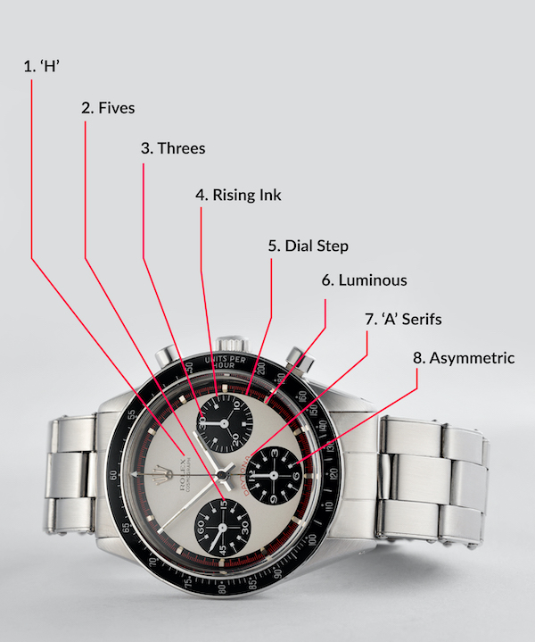
8 Key Details of the Paul Newman Dial
Not only is the Paul Newman dial very different to the classical Rolex Daytona, it also contains distinctive iconographic subtleties that for decades remained secret, shared only amongst the most fastidious collectors. Here's a list of some of the nearly-microscopic design elements that distinguish and validate a genuine Rolex Daytona Paul Newman:
1. The letter H in Cosmograph.
2. The way the 5s are printed.
3. The way the 3s are printed.
4. The way the printing ink rises in the sub-dials.
5. The step-down at the dial’s edge.
6. The texture of the luminous dots.
7. The way the A is printed in the word Daytona.
8. Asymmetry of one of the sub-dial batons.
_____________________________________
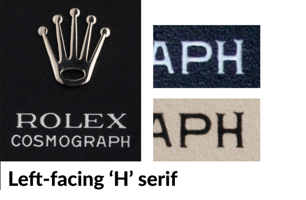
1. The terminal letter H in the word Cosmograph has a distinctive left-facing serif on the upper edge of its right-most limb. This detail is found on many examples of both black- and white-dialled Rolex Paul Newmans. This detail creates an aesthetic and typographical balance whose omission would otherwise distract the subconscious eye.
_____________________________________
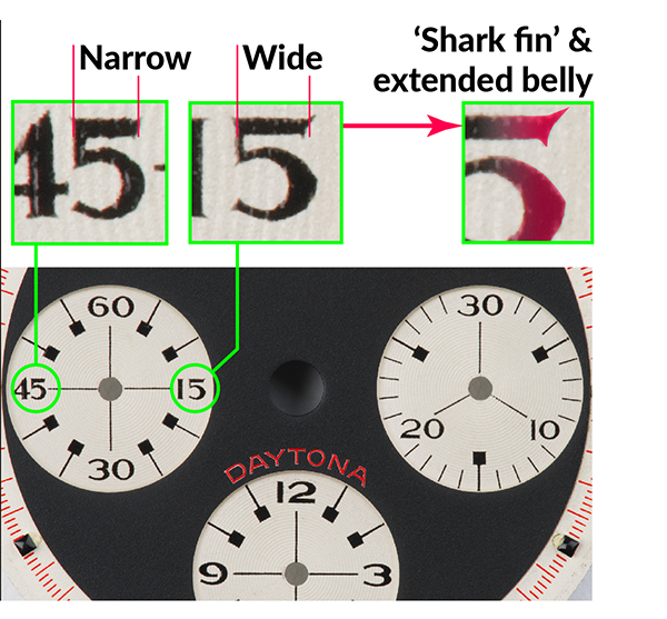
2. The number 5. The top cross-bars of the fives differ. The one at 45 is shorter, with a less-sharp serif. The one at 15 is longer, and the serif extends well above and below, joined by a curved terminal, giving it the nickname the shark’s fin.
The bowl of the 5 at right is more pronounced than its counterpart, with an almost Gothic peak, giving it an extended shape.
_____________________________________

3. The number 3. Like the 5s, these also differ from digit to digit. These close-ups are at the same scale. Notice the different character weights – the middle 3 is heavier. The first two also have their upper and lower limbs lined up, whereas the last one (the primary marker on the chrono-minutes counter) has a pronounced extension to its lower limb, stretched well beyond the rest of the digit.
_____________________________________
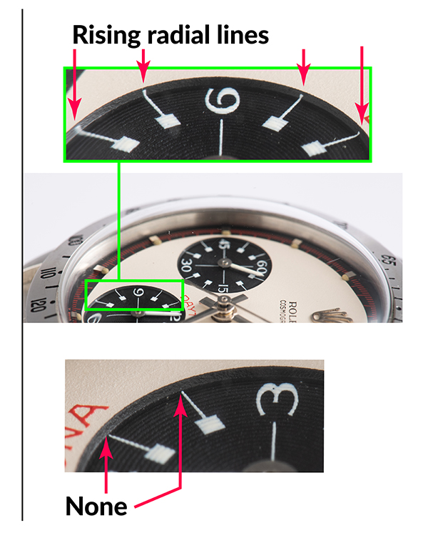
4. Notice the printed radial lines in the sub-dials. In some cases, they rise markedly up the dished edge of the area, for example in the upper photo. Turning to look the other way in the same sub-dial (lower photo), the radial lines do not rise, they stop precisely within the dished area.
This is a peculiarity of Paul Newman dials. These rising lines vary in exact intensity and placement from watch to watch.
They are the result of the hand-operated pad-printing machines used in watch dial manufacture. The rising lines are vestigial strings of viscous printing ink. Slight variations in printing pressure, or the humidity affecting the gelatine printing pad and the printer's ink, result in small variations. These beautiful details are only visible at very high magnification.
_____________________________________
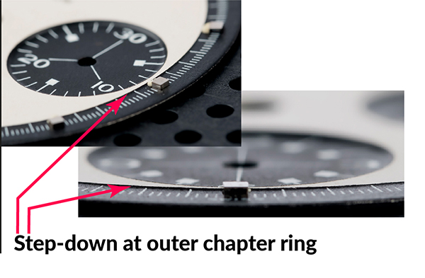
5. At the edge of the dial’s main field, there is a tiny step down to a lower surface. This small but distinct step is best seen by tilting the dial steeply. It's a cut, directly into the underlying brass dial plate, only fractions of a millimetre deep.
Again this is an aid to legibility, because it prevents having the black and cream printing inks touch each other directly, which would lead to an imperfect transition.
_____________________________________
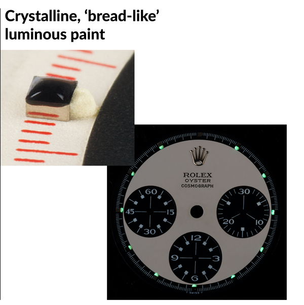
6. The tritium luminous marks have a beautiful texture, like a baked dessert, with a fine porus crystalline appearance. In each case, the luminous dot rises from its spot on the dial’s lower step, just kissing the upper surface. There is never any luminous dot at 12.
The luminous paint ought not to self-glow very brightly anymore, if at all. Its self-luminosity halves about every twelve years, so after more than 50 years, a mid-1960s dial might only have 5% of its original power. You normally see a bright glow if the dial is put into ultra-violet light.
_____________________________________
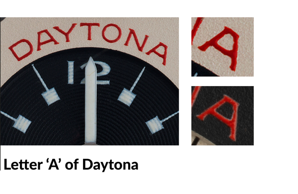
7. The terminal letter A in the word Daytona is capped with sharp serifs that appear almost as tiny horns.
Serifs are both aesthetic and practical. They help guide the eye as it moves along lines of text; they also add definition and clarity to very small characters. Finally, they also help viscous printing ink to draw fully into the glyph’s sharp corners. Every one of these details renders the watch easier to read and is typical of Rolex’s renowned attention to detail.
_____________________________________
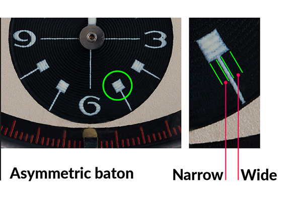
8. The sub-dial baton at 5 o’clock is slightly asymmetrical with respect to its square cap. The cap is shifted round sightly anti-clockwise. An aid to balance the empty space, or a small error in the printing plate? You decide.
_____________________________________
Other Interesting Daytona Details
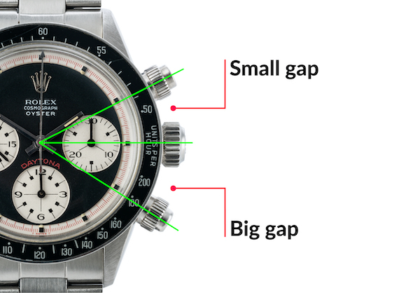
The watch has an interesting optical illusion. The gaps between the crown and each of the chronograph pushers are different. The gap at the top is smaller. Normally this isn't noticeable, but if you rest a fingertip in each space, it quickly becomes obvious.
Why is it this way? It's because of the watch movement within, a Valjoux calibre 72. For technical reasons, the internal chronograph levers have to be positioned asymmetrically.
_____________________________________
The Valjoux Calibre 72
Rolex Daytona watches from this period used a movement by an outside supplier, the venerable specialist chronograph builders, Valjoux. This use of specialist out-source suppliers was standard practice in the watch industry until the late 1990s. Even the biggest names, including Rolex and Patek Philippe, bought their chronograph base calibres from others – Patek from Lemania and Rolex from Valjoux.
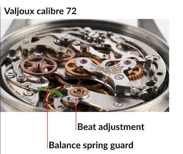
The Valjoux calibre 72 originates from a movement first produced as long ago as 1914. There are numerous variations. Rolex introduced a number of their own improvements to the calibre, making the Daytona reliable and robust.
For example, the watch has a very high-grade ‘Breguet’ spring, where the final coil of the spiral is raised up in its own layer above the rest of the spring. However, if the watch gets a jolt, the coiled layers might tangle. To avoid this, Rolex sometimes fitted a balance spring guard, a slender hard bronze blade interlaced between the spring's two layers to keep them apart (seen here in green highlight).
This watch is also free-sprung, meaning the balance spring is a fixed length. Many other movements have an adjustable ‘regulator’ to alter the rate. The regulator makes adjustment easy, but can be unpredictable, so Rolex did away with it. What appears to be a regulator in the photo is actually a Rolex modification, the beat adjuster. 'Setting the beat' makes the ‘ticks’ and the ‘tocks’ exactly equal, which improves reliability and ease of service.
_____________________________________
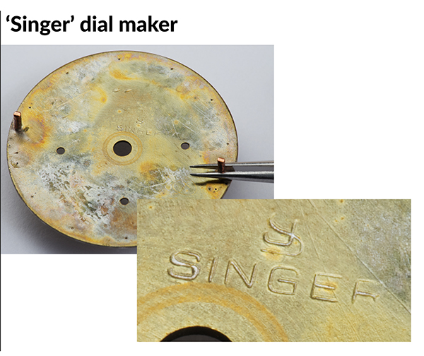
Dial Made by Singer
Here's a rare look under the dial of a Paul Newman. 'Singer' was the dial manufacturer who supplied these to Rolex. This stamp is often slightly uneven.
The distinctive way that original Paul Newman hour markers are attached is also visible. Each hour chapter has a single foot, riveted cleanly and sharply from behind with a single blow, wihout any sign of chisel cuts and punch marks that would indicate re-finishing.
_____________________________________
About the Watches and the Photos
Thank you for reading this article. We tried to keep it as concise and factual as possible, so that as a collector or watch enthusiast you can get exactly what you need to know without all the distracting prose that often pads out information online.
All the Rolex Daytona watches illustrated in this article are from the private collection of The Watch Club in London. We photographed each one in our own studio. This is how we managed to select and shoot such specific details, so as to share our first-hand experience. A few of the watches have since found their way into other collections. Watches that once changed hands for £50,000–£70,000 now cannot be had for five times that. Vintage Rolex watches never cease to reward their owners with exceptional quality and return of value.